Tuesday, May 16, 2017

Evaluation

At the start of this brief I struggled to find a group as everyone had already split off and formed their own groups the week before, so trying to find a group to join that I thought I would work well in and would benefit me with my work was hard. I had then asked Guy and Dan if I could join their group and although Dan was happy with the idea of me joining their group Guy was hesitant.
We had all met up to discuss our strengths with in our work to make it easier for us when we start pre-production, I was happy that both Dan and Guy put me in charge of Pre-production as this is what I feel like I do best in with in my own work. I feel as if I was really organised at the start of this brief as I had managed my time so well, and I had done all the research on Alzheimer’s ready for when we start animating, the only thing I’m unpleased about is, I had done so much research and spent so much time getting in contact with care homes to see if we could visit with permission, but unfortunately we were unable to find a care home close enough for us to visit.
Guy had also recorded me and Dan talking about our experience with having a close relative suffer from Alzheimer’s disease, because we were all so focused on trying to come up with a really good and effective idea for our animation, we had completely forgotten that both of us know what its like to see someone suffer with the disease, and take a step back and see if we could come up with an idea out of either of our answers to a set of questions that the three of us had written. Which we then used for people who emailed us in response to our poster. The poster was then posted all around the university, which I really enjoyed doing as I like the whole design side of projects and I think this is why I enjoy pre-production so much and this brief has made me realise this, so this will be something that I will continue in the future. Another thing is, I was really pleased with the outcome of the poster as we had so many responses of people wanting to share their stories of experiencing someone so close to them have Alzheimer’s.
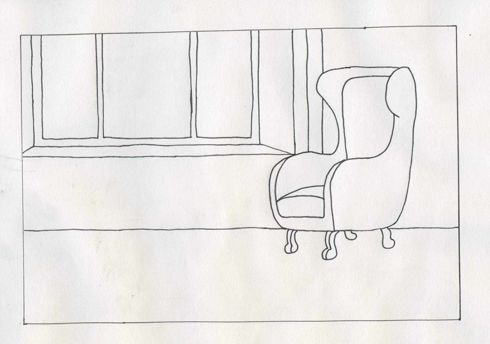
 I had also enjoyed creating the room designs, as it gave me a chance to further my skills with layout design and also it gave me a chance to improve on my drawing skills too as I had drawn up different chair designs that where going to be included in the different scenes with in the animation. I personally think that after designing the backgrounds it has made me realise that I would like to improve my skills doing this too as I want my pre-production skills to be the best they can be.
I was unhappy at the start knowing that I wouldn’t be actually animating anything for this brief, as I thought that my work that I had done/ was doing was less important but now looking back I am quite happy that I didn’t as the work that I had mostly completed for this brief was design work and coming from a background where I have studied graphic design for multiple years, I think I was probably the best person out of my group to do the design side of the project and I am really happy with all the work I have done.
Working with Dan and Guy was so much fun and not only have I enjoyed working with them both but I have also learnt so much about how they work as individuals and work with in a team. I think that we have all helped each other throughout this brief as we have not criticised each other’s work but only given advise on how to improve each other’s work. We made sure as a group that we are always helping each other when needed instead of someone having nothing to do and others having too much to do that they are unable to finish any work. I think in the future I would definitely consider working with both Dan and guy again.
If I could go back and change anything it would be how I managed my time towards the end of the brief as I wasn’t able to finish all the backgrounds for scenes 2 and 3 in time for when Dan needed them for the line tests


Study Task 1- For Arguments sake


Most people think that the railway has always been owned by the government but in fact it has spent most of its history in private hands
Britains railways were nationalized by the post war labour part in 1948 and returned to being private in 1993 because of the conservative government, which says it all really!
Renationalizing the railways was suppose to happen again in 1997 but then Tony blair put that to a stop 


The main argument for nationalising the railways again is to reunite all rail networks with the train running on it under a common owner
If the railway was nationalised again it would save money and with all the profits made, it would be reinvested back into the railways, instead of all the profits being distributed to the share holders in other countries.
According to a yougov survey  60 percent of the british public support the idea of renationalizing the railways 

(Train fairs have increased at twice the speed of wages since 2010) and that’s because almost every year for a decade the government has put up the ticket prices by more than inflasion.  But some train fairs have increased by 245% under this system.
Since privatation passenger numbers have  doubled, which has lead to over crowding on trains
Because none of the profits get invested back into the railways they are given to shareholders in countries such as Germany, france and the Netherlands, but the private train operating companies made over 200 million pound in profit last year which we could use to improve the railways instead of the shareholders bank accounts


The promise of privatisation initially was that it would drive competition and competion would drive fairs down but in reality the fairs have only increased making it unaffordable.
The Mersey rail is a joint partnership, it is both a private company and the Netherlands state rail operator’s international arm, and the dutch state takes a share of profits  which totaled £10.77m 
Whereas the London’s Overground network  which is also a joint partnership between the German state rail operator Deutsche Bahn and private company MTR. made £7.54m profit, which is shared between the two


These are screenshots from my presentation for study task 1- For arguments sake, and these are all my notes that I had taken and had used for my presentation.

Week 13- Animated Documentary


These are some more line tests that Dan and guy had both done, I had also helped with both of these scenes too with cleaning up the frames. 

This week my main focus was on creating the DVD cover for our animation. 


I wanted to have the DVD cover quite dramatic looking to grab the viewers attention, so I had taken the background of our second scene and used that as the main image for the front cover. Guy had then told me what font I should include as this is the font that will be used with in the animation. I had researched what typical DVD covers looked like as this would help me with the layout of our DVD cover. 


I had then printed out the DVD to test what it looks like in the case and the image was too dark and the font was too dark also. The image above is of the final DVD cover, I had edited the levels and the colours to ensure that everything is visible and easy to read. I had asked Dan to write the synopsis as I thought that he was probably the better writer out of the three of us in the group. I had also included an image of the first scene with all three characters, I had them made it look as if it was a worn picture from a photo album as I thought that this would fit the aesthetic of our animation as Photos are kept for memories and memories are lost with Alzheimer's, which I had thought would be really effective. I wanted to keep the DVD cover really simple as our animation is quite minimalist.  


These are the finished DVD covers in the case 


Below is our press kit that me and Guy had worked on. Guy was the one who mainly worked on this press kit and I helped with layout. 


Week 10/11/12- Animated Documentary

For these three weeks I didn't have much to do for the animation as the production of our animation had started and Guy and Dan were both working on the key frames and the inbetweens of the characters. because I was working on the pre-production and will be working on post-production, I was not actually animating anything.

After both Dan and guy had finished one the line tests of the characters, I had then took some of the frames to clean up, and save as a PNG file so they were ready to be uploaded on to the animation, I had started off on the grandmother character first. This line test was done by both Dan and Guy. Guy has written me some instructions on the shortcuts for photoshop so that I could complete the clean up of the scenes quicker, I was really thankful for this as it had saved so much time and I was able to complete the majority of the frames for this scene in a short period of time.


Week 9- Animated Documentary


Dan had suggested that we should try and create the backgrounds as cut out because he felt as if they would fit the aesthetic of our animation more. Dan had then quickly created this background to test the key frames of the characters on top, we had all agreed that we all liked the backgrounds in this style and that we should stick to the cut out backgrounds 


I had then started designing the background for the first scene of our animation, me and Dan had both decided that having the backgrounds as cut out would bring more depth to the animation as we could layer the different paper. For this background I had kept to the animatic scene as this is the layout that we wanted for the animation. I had changed which coloured card would be used for the walls and the chair because I felt as if they didn't really fit and look right, I had also added a darker bown colour to the background because the background needed more depth and with out it, it would have looked too flat.

Thursday, April 27, 2017

Evaluation

When Starting this module, I had started on the collaborative brief, working with two graphic designers for the thirsty planet YCN brief, I am really happy with all my work for this brief as I think it looks professional, I think that the posters work well in a set together and I think that the water bottles that I have designed to, look really good and professional for a campaign. I started this brief thinking that working with two graphic designers on a campaign brief would either go two ways, one where they’re really helpful and the feedback that I receive of them will be really constructive or where I feel like they would take over the design part of the brief because they have a better understanding of what is being asked for the brief. After we finished this brief and looking back at the work that I had done for it, I am really proud of myself as I personally think that I have done a good job on both the posters and the water bottles.

If I could go back and change anything about this brief would be to actually make the posters in to screen prints as I would like to further my skills in screen printing, and another thing that I would change would be how many times that I would meet up with my group because one member of the group didn’t turn up to any of the meeting that we had organized with in the first 3 weeks which made it extremely difficult to continue with any work because they didn’t know what we were doing. We had also submitted all our work to YCN on time, but I was unable to blog the screenshot of the submission because when I asked for the screenshot confirming we has submitted, I didn’t receive it from my other group members.

The Ohh Deer brief that I had submitted to was probably my most favorite brief this module, this is because there was so much freedom to design anything that I wanted, and because I based this brief off something that I loved so much I enjoyed it the most. I am also really happy with the outcome of my design too, I think the illustration is really strong and the font works well with the whole design.

The brief that I think was my weakest work for this module was my Loopdeloop animation, I think that its not my strongest piece of work that I’ve done and If I would have spent more time on it, it probably wouldn’t look so bad. I would also change the colours that I’ve chosen for both the character and the background as I don’t think that the colours work well together.


I have learnt that I need to manage my time and get myself more organized for future briefs, because I feel as if I didn’t leave myself enough time to finish some briefs or even finish my work to the best of my ability, and it shows in my loopdeloop animation. I am really disappointed in myself for that brief because I know that I could have done so much better, and being on an animation course which I enjoy so much, my animation should be my main priority and made to the best of my ability. 

Wednesday, April 26, 2017

Studio Brief 3- Project report

Studio Brief 2- Art board

Thirsty planet


For my collaborative brief, I have chosen to work on the Thirsty planet brief, working alongside two graphic designers Alice Morris and Dom Cartledge. I decided it would be best for me to work alongside two graphic designers because I know I am able to do the illustrations or an animation if we choose to create one, and I would only need help with any typography and layout because they are no my strong points. 


These are my concepts for the posters, I wanted to create two posters that would work well as set. I decided to work from the idea of including the elephant pump and the other poster will have an illustration of an elephant on it. After sketching out some poster ideas I planned out what colours the illustrations would be as I wanted them both to look similar. 


These were my first two poster designs that I had created for Thirsty planet, we decided that not using illustrations of children or people that live in Africa was probably best for a campaign because people don't usually act upon the adverts that are shown of the people who live in Africa travelling to get water or who are hungry. We had then decided that having an elephant on the poster who probably work better because the pumps that are then provided to people are called elephant pumps, so in the poster designs we would have one with the elephant and another one of the elephant pump. 

Me and my group all decided that the second poster with the elephant would work out better because where the water is coming out of the trunk on the first poster it doesn't line up properly and the layout of the poster just works better than the first design. 


I then carried on playing around with the layout and decided that there was too much blank space within the poster so I had enlarged the elephant illustration.  I had also went back to the brief package because the colours were slightly off and they needed to be RGB colours. We did plan on making these posters using screen print but because we didn't have long for this brief, trying to plan to screen print and set up the templates and trying to organise for us to go in and screen print we thought we would play it safe and create digital posters. 


We then had a crit with the graphic design tutor simon, and the feed back we received was to try and aim our campaign at people who already drink water instead of aiming our campaign at people who don't usually drink water. We had then all met up and decided that we would work towards aiming it at athletes, people who attend business meetings and businesses themselves. We then planned to create water bottles and glasses and water fountains, these can be used by anyone but mainly to our new target audience. 
These are the water bottle designs that I had created, we decided to go with the top designs for each bottle with the logo going down the side of the bottle as the logo going across the bottom of the bottle looks too cramped and its not as effective as the first ones. These bottles were designed for people who are on and the go and usually carry a bottle of water around with them and athletes. I tried to keep to the thirsty planet colours with the blue, red and white for the bottles. 
These are the final water bottle designs for this brief, I am really happy with how they look. I tried to keep to really simple water bottle shapes designs, that Myself and others use, instead of creating a different water bottle shape. For the water bottles a loyalty concept was developed whereby water bottles can be bought and used specifically for the thirsty planet water dispenser. This in turn promoting the water, and getting the brand out there.


After the crit we were unsure whether or not to keep the posters in our campaign but we all agreed that the elephant poster was a really strong design and wanted to keep it, but because we was so unsure whether to keep the posters or not, I was a bit short of time to create the second poster of the water pump. 


Although this poster is in the same style as my other Thirsty planet poster, I personally think that this poster is weaker than my other design, I just feel like there is too much blank space and its just not as effective as the other one. My original idea was to have just a normal tap as the illustration but then after researching what and elephant pump looks like I thought that it wouldn't work as well, as thats not what the elephant pump looks like. 


These are the two posters together. my initial idea was to have the water coming down on one poster and on the other have the water going up with the heart in the center of each water droplets. I am happy with both designs, I just think that there could be some improvements to the water pump poster, and I think this is because on the elephant poster it has more white lines within the illustration where as the water pump poster does not.  the poster campaign was developed in order to gain attention from a younger consumer. These posters would be placed around universities and other locations that specifically target a young audience. Key iconography has been used in order to target a fun, consciously aware audience.  

Studio Brief 1- Art boards

Character design challenge


For this months character design challenge the theme was Game of thrones, which I was really happy about because I love game of thrones. I started off by making a mood board of my favorite  characters from the Tv series, and I had thought that not many people might go for Ramsay Bolton, so I had decided to choose him for my character for this competition. I had then made a separate board for reference pictures of Ramsay Bolton 


I had then sketched out my drawing of Ramsay Bolton, and outlined it with fine liner, this was because It would be easier for me to edit and add colour too when I come to adding it to photoshop. Although I did have trouble trying to select certain parts of the image on photoshop when I needed to delete the background. 


This is my finished character design, I am happy with how it looks, I just think that I could have made it look better when adding colour to it digitally, as I think the image looks a bit too flat and there isn't much depth the the design. But over all I am happy with how it looks 


To submit to the character design challenge competition, you had to submit by posting your character design on their facebook page and then they approve your character design before posting 


6 loopdeloop


For this months loopdeloop animation the theme was six, I had thought of a really simple animation idea where the alarm clock changes to six in the morning. The image above is a quick storyboard idea that I had done for this animation. 


This is my animatic for this animation, I had worked from my storyboard panels but had neaten up all the lines for my animation, I had changed the last scene though from looking down at the character from a birds eye view, to having the camera angle at the side of her. I decided to have the morning song by Edvard Grieg at the beginning because it is mostly used on scenes like this, when someone is about to wake up of a morning, but then decided to have the alarm clock soundtrack cut it off completely. 


This is my finished animation for the Loopdeloop competition. I personally think that this animation could be so much better, as I could have taken more time with drawing the backgrounds and what colour the background was going to be. I just think that the whole animation could have looked better, if I had worked harder on this competition.

I had also added a different competitions work in this animation, this was because there was too much blank space at the right side of my animation, and I made it look as if it was a poster on the wall. 


To be able to submit my work to Loopdeloop I had to upload my animation to vimeo beforehand and then copy and paste the video url, after this I had submitted my animation for this months competition. 

chicken loopdeloop


These are some drawings that I had done for the chicken animation competition for Loopdeloop, I wanted to create something really simple, so I tried to keep the design of the chickens not too detailed.

For my animation idea I had decided to go with the chicken running but behind the chicken the background would be moving. I had started off by trying to research how chickens actually run but I found it difficult to search for chicken run cycles online because it just continued to bring up chicken run the film. This image was the only thing that I could find that demonstrates the leg movements for a chicken to run. 
I had then decided that I would make the chicken headless.  drawn up my chicken design on photoshop, as I was going to do a digital animation. 
Unfortunately I was unable to finish this months animation competition, as I had missed the deadline for submission,  


Ohh deer competition

For the Ohh Deer competition I had decided to create a card based on Fleetwood Mac with the lyrics 'You make loving fun' on the card. My initial idea was too have the whole band on the front of the card but instead I decided to go with in my opinion the two most iconic couple in the band, which is Stevie Nicks and Lindsey Buckingham.


I tried to find the most iconic picture of both Stevie and Lindsey, that most people would recognise, although this picture was before they joined Fleetwood Mac, I still thought that I would be effective to use for this card design. 


I had used the image as a template for my illustration for the card, I personally thought that it also looked better if I didn't include the eyes, but still had the main facial features to were you are still able to know who they both are 


After finishing the illustration, I then started to layout the card design, and I had found a font similar to the same font on the Rumours album, because that was one of their most famous albums. I also choose to have the background the peach colour because the card was suppose to be for a valentines day card, so having quite pink colours would suit the card the best.   


Once I had finished my card design and I was happy with it, I had then submitted it to the Ohh Deer website. I then checked my Ohh deer profile where it tells me that my submission is live. and the last image is just a screenshot of my emails off Ohh Deer, telling me that my card design had been approved. 

Monday, March 27, 2017

Week 8- Animated Documentary

We had all agreed that using colours on the room design was too much because we were wanting to keep the background subtle, Dan had told me to try designing the background using brown tones as they create more depth. Im really happy with how this background looks as they are still warm colours, and they don't stand out too much, which is what we were wanting as we didn't want to take the focus off the characters. 


These where some of the chair designs that I had drew up for the second scene, which will be in the care home. We wanted quite square and harsh looking chairs in this scene in comparison to the first scene where the chair is quite round and looks comfy. We had all agreed on that the second chair is probably the best one as that is probably what they have in care homes. 


Week 7- Animated Documentary


This week I had made a start on drawing up the room designs for the backgrounds for out animation. I had started off by drawing up a simple line drawing of the room and then added colour, the first design I tried to use warm tone colours for the room but after talking to both dan and Guy we all agreed that it probably wont work with the style of the animation that we are wanting. 


I had then changed the windows in the room because the first design didn't really look right, I had also tried to use water colours for the next two designs as we wanted the colours quite subtle. 


For this design I had worked from the scene in the animatic as the perspective in the other designs wasn't quite right. Working from the animatic made it easier for me as all I had to do was try and test the colour on this design.