Thursday, April 27, 2017

Evaluation

When Starting this module, I had started on the collaborative brief, working with two graphic designers for the thirsty planet YCN brief, I am really happy with all my work for this brief as I think it looks professional, I think that the posters work well in a set together and I think that the water bottles that I have designed to, look really good and professional for a campaign. I started this brief thinking that working with two graphic designers on a campaign brief would either go two ways, one where they’re really helpful and the feedback that I receive of them will be really constructive or where I feel like they would take over the design part of the brief because they have a better understanding of what is being asked for the brief. After we finished this brief and looking back at the work that I had done for it, I am really proud of myself as I personally think that I have done a good job on both the posters and the water bottles.

If I could go back and change anything about this brief would be to actually make the posters in to screen prints as I would like to further my skills in screen printing, and another thing that I would change would be how many times that I would meet up with my group because one member of the group didn’t turn up to any of the meeting that we had organized with in the first 3 weeks which made it extremely difficult to continue with any work because they didn’t know what we were doing. We had also submitted all our work to YCN on time, but I was unable to blog the screenshot of the submission because when I asked for the screenshot confirming we has submitted, I didn’t receive it from my other group members.

The Ohh Deer brief that I had submitted to was probably my most favorite brief this module, this is because there was so much freedom to design anything that I wanted, and because I based this brief off something that I loved so much I enjoyed it the most. I am also really happy with the outcome of my design too, I think the illustration is really strong and the font works well with the whole design.

The brief that I think was my weakest work for this module was my Loopdeloop animation, I think that its not my strongest piece of work that I’ve done and If I would have spent more time on it, it probably wouldn’t look so bad. I would also change the colours that I’ve chosen for both the character and the background as I don’t think that the colours work well together.


I have learnt that I need to manage my time and get myself more organized for future briefs, because I feel as if I didn’t leave myself enough time to finish some briefs or even finish my work to the best of my ability, and it shows in my loopdeloop animation. I am really disappointed in myself for that brief because I know that I could have done so much better, and being on an animation course which I enjoy so much, my animation should be my main priority and made to the best of my ability. 

Wednesday, April 26, 2017

Studio Brief 3- Project report

Studio Brief 2- Art board

Thirsty planet


For my collaborative brief, I have chosen to work on the Thirsty planet brief, working alongside two graphic designers Alice Morris and Dom Cartledge. I decided it would be best for me to work alongside two graphic designers because I know I am able to do the illustrations or an animation if we choose to create one, and I would only need help with any typography and layout because they are no my strong points. 


These are my concepts for the posters, I wanted to create two posters that would work well as set. I decided to work from the idea of including the elephant pump and the other poster will have an illustration of an elephant on it. After sketching out some poster ideas I planned out what colours the illustrations would be as I wanted them both to look similar. 


These were my first two poster designs that I had created for Thirsty planet, we decided that not using illustrations of children or people that live in Africa was probably best for a campaign because people don't usually act upon the adverts that are shown of the people who live in Africa travelling to get water or who are hungry. We had then decided that having an elephant on the poster who probably work better because the pumps that are then provided to people are called elephant pumps, so in the poster designs we would have one with the elephant and another one of the elephant pump. 

Me and my group all decided that the second poster with the elephant would work out better because where the water is coming out of the trunk on the first poster it doesn't line up properly and the layout of the poster just works better than the first design. 


I then carried on playing around with the layout and decided that there was too much blank space within the poster so I had enlarged the elephant illustration.  I had also went back to the brief package because the colours were slightly off and they needed to be RGB colours. We did plan on making these posters using screen print but because we didn't have long for this brief, trying to plan to screen print and set up the templates and trying to organise for us to go in and screen print we thought we would play it safe and create digital posters. 


We then had a crit with the graphic design tutor simon, and the feed back we received was to try and aim our campaign at people who already drink water instead of aiming our campaign at people who don't usually drink water. We had then all met up and decided that we would work towards aiming it at athletes, people who attend business meetings and businesses themselves. We then planned to create water bottles and glasses and water fountains, these can be used by anyone but mainly to our new target audience. 
These are the water bottle designs that I had created, we decided to go with the top designs for each bottle with the logo going down the side of the bottle as the logo going across the bottom of the bottle looks too cramped and its not as effective as the first ones. These bottles were designed for people who are on and the go and usually carry a bottle of water around with them and athletes. I tried to keep to the thirsty planet colours with the blue, red and white for the bottles. 
These are the final water bottle designs for this brief, I am really happy with how they look. I tried to keep to really simple water bottle shapes designs, that Myself and others use, instead of creating a different water bottle shape. For the water bottles a loyalty concept was developed whereby water bottles can be bought and used specifically for the thirsty planet water dispenser. This in turn promoting the water, and getting the brand out there.


After the crit we were unsure whether or not to keep the posters in our campaign but we all agreed that the elephant poster was a really strong design and wanted to keep it, but because we was so unsure whether to keep the posters or not, I was a bit short of time to create the second poster of the water pump. 


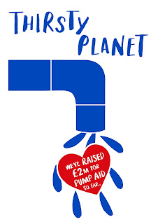
Although this poster is in the same style as my other Thirsty planet poster, I personally think that this poster is weaker than my other design, I just feel like there is too much blank space and its just not as effective as the other one. My original idea was to have just a normal tap as the illustration but then after researching what and elephant pump looks like I thought that it wouldn't work as well, as thats not what the elephant pump looks like. 


These are the two posters together. my initial idea was to have the water coming down on one poster and on the other have the water going up with the heart in the center of each water droplets. I am happy with both designs, I just think that there could be some improvements to the water pump poster, and I think this is because on the elephant poster it has more white lines within the illustration where as the water pump poster does not.  the poster campaign was developed in order to gain attention from a younger consumer. These posters would be placed around universities and other locations that specifically target a young audience. Key iconography has been used in order to target a fun, consciously aware audience.  

Studio Brief 1- Art boards

Character design challenge


For this months character design challenge the theme was Game of thrones, which I was really happy about because I love game of thrones. I started off by making a mood board of my favorite  characters from the Tv series, and I had thought that not many people might go for Ramsay Bolton, so I had decided to choose him for my character for this competition. I had then made a separate board for reference pictures of Ramsay Bolton 


I had then sketched out my drawing of Ramsay Bolton, and outlined it with fine liner, this was because It would be easier for me to edit and add colour too when I come to adding it to photoshop. Although I did have trouble trying to select certain parts of the image on photoshop when I needed to delete the background. 


This is my finished character design, I am happy with how it looks, I just think that I could have made it look better when adding colour to it digitally, as I think the image looks a bit too flat and there isn't much depth the the design. But over all I am happy with how it looks 


To submit to the character design challenge competition, you had to submit by posting your character design on their facebook page and then they approve your character design before posting 


6 loopdeloop


For this months loopdeloop animation the theme was six, I had thought of a really simple animation idea where the alarm clock changes to six in the morning. The image above is a quick storyboard idea that I had done for this animation. 


This is my animatic for this animation, I had worked from my storyboard panels but had neaten up all the lines for my animation, I had changed the last scene though from looking down at the character from a birds eye view, to having the camera angle at the side of her. I decided to have the morning song by Edvard Grieg at the beginning because it is mostly used on scenes like this, when someone is about to wake up of a morning, but then decided to have the alarm clock soundtrack cut it off completely. 


This is my finished animation for the Loopdeloop competition. I personally think that this animation could be so much better, as I could have taken more time with drawing the backgrounds and what colour the background was going to be. I just think that the whole animation could have looked better, if I had worked harder on this competition.

I had also added a different competitions work in this animation, this was because there was too much blank space at the right side of my animation, and I made it look as if it was a poster on the wall. 


To be able to submit my work to Loopdeloop I had to upload my animation to vimeo beforehand and then copy and paste the video url, after this I had submitted my animation for this months competition. 

chicken loopdeloop


These are some drawings that I had done for the chicken animation competition for Loopdeloop, I wanted to create something really simple, so I tried to keep the design of the chickens not too detailed.

For my animation idea I had decided to go with the chicken running but behind the chicken the background would be moving. I had started off by trying to research how chickens actually run but I found it difficult to search for chicken run cycles online because it just continued to bring up chicken run the film. This image was the only thing that I could find that demonstrates the leg movements for a chicken to run. 
I had then decided that I would make the chicken headless.  drawn up my chicken design on photoshop, as I was going to do a digital animation. 
Unfortunately I was unable to finish this months animation competition, as I had missed the deadline for submission,  


Ohh deer competition

For the Ohh Deer competition I had decided to create a card based on Fleetwood Mac with the lyrics 'You make loving fun' on the card. My initial idea was too have the whole band on the front of the card but instead I decided to go with in my opinion the two most iconic couple in the band, which is Stevie Nicks and Lindsey Buckingham.


I tried to find the most iconic picture of both Stevie and Lindsey, that most people would recognise, although this picture was before they joined Fleetwood Mac, I still thought that I would be effective to use for this card design. 


I had used the image as a template for my illustration for the card, I personally thought that it also looked better if I didn't include the eyes, but still had the main facial features to were you are still able to know who they both are 


After finishing the illustration, I then started to layout the card design, and I had found a font similar to the same font on the Rumours album, because that was one of their most famous albums. I also choose to have the background the peach colour because the card was suppose to be for a valentines day card, so having quite pink colours would suit the card the best.   


Once I had finished my card design and I was happy with it, I had then submitted it to the Ohh Deer website. I then checked my Ohh deer profile where it tells me that my submission is live. and the last image is just a screenshot of my emails off Ohh Deer, telling me that my card design had been approved.